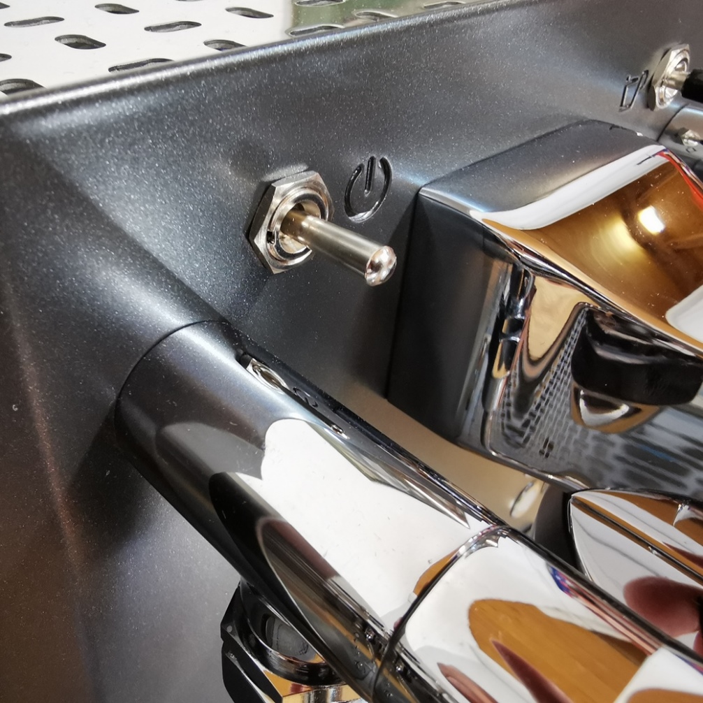
Our goal was to design an espresso machine that looks elegant on the one hand, but retains its traditional origin on the other hand.
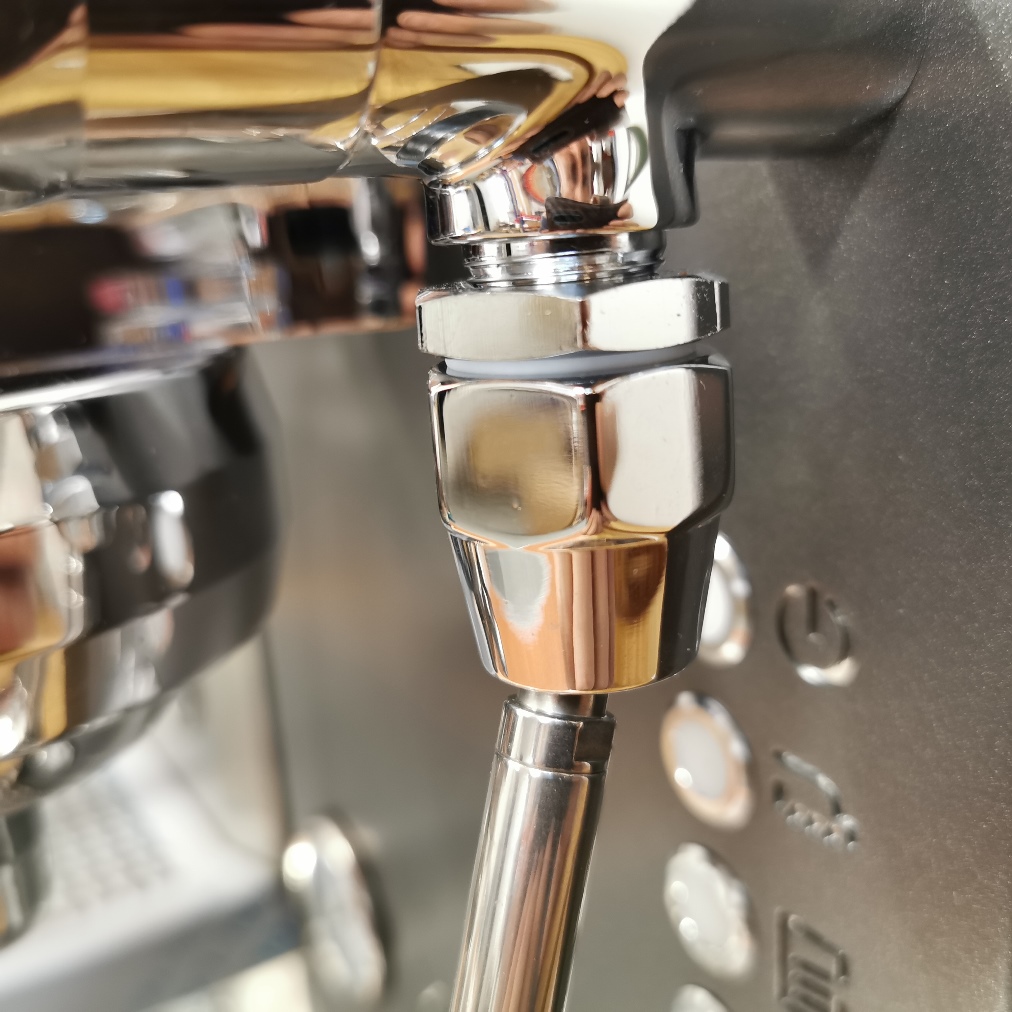
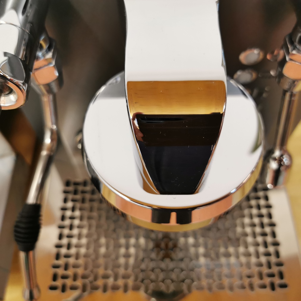
In order to create an elegant design, we have focused on straight, clear lines and slight curves. For example, this can be clearly seen from the plain, elegant railing or the slim, curved body of the brew group. In addition, we try to do with as few screws as possible (which interfere with the optics). The width/ height ratio is roughly based on the “golden ratio” in order to create a harmonious overall appearance.
The optically balanced impression is supported by the special finish of the visible stainless steel parts, for which reflective stainless steel or coloured panels are used.
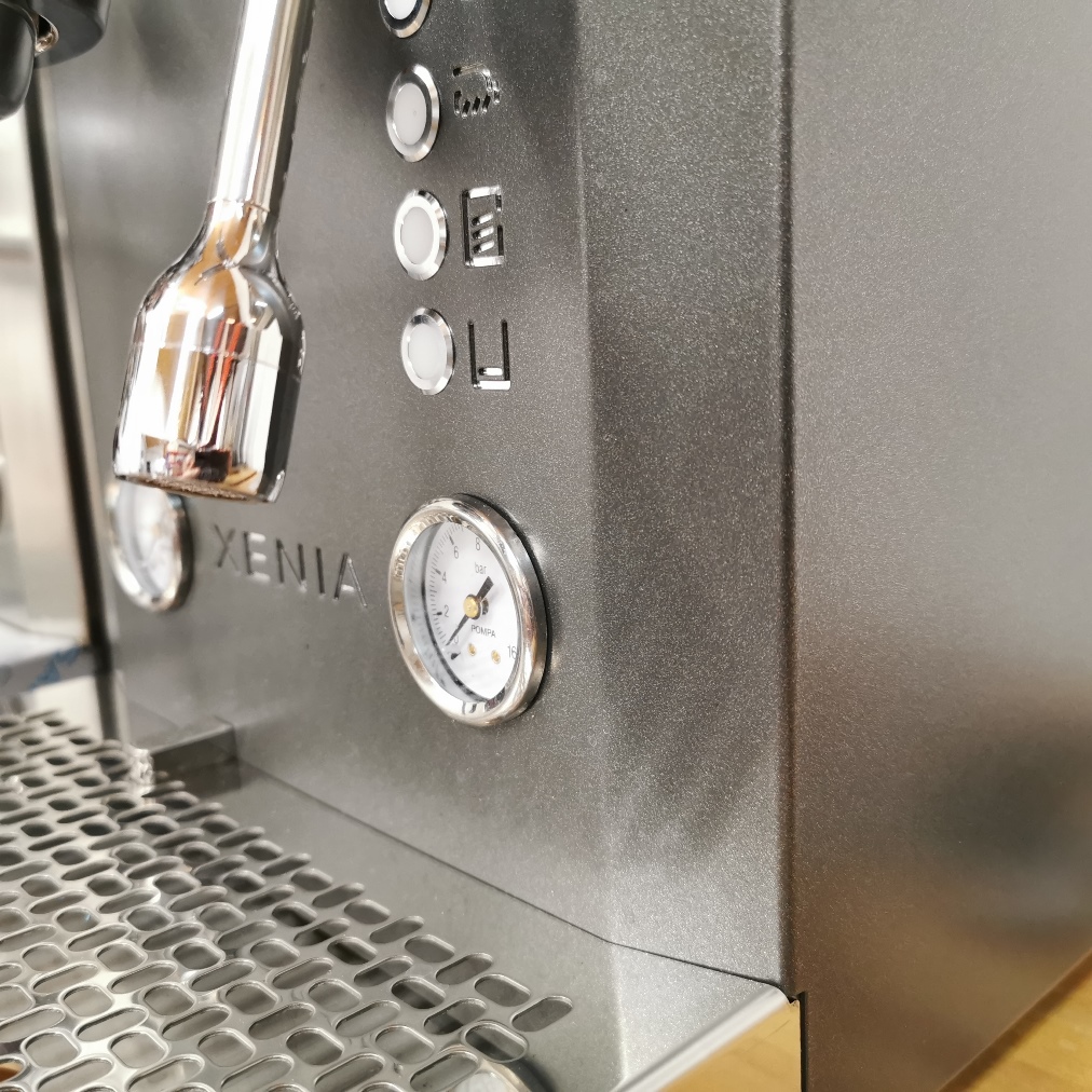
The traditional appearance is achieved by the fact that the shape of the housing and the arrangement of the control elements follow the familiar pattern and do without extravagance. Components that appear inharmonious on a traditional machine (such as the displays of the PID controller) are moved inside or are controlled by mobile phone.
Naturally, these types of machines are somewhat cube-shaped. But to prevent this angular impression, the edges were slanted by 15 °.
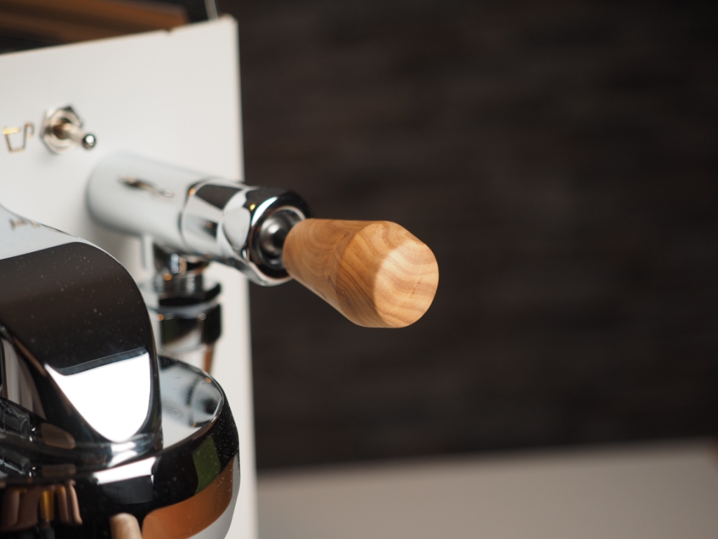
Since the design is perceived very differently, everyone can configure his machine as desired. There is also a large selection of components.
We also tried to do without screws as much as possible. Screws are necessary, but they have one disadvantage: They interrupt surfaces, affect good looks, and interfere with cleaning.
As you can see in the many pictures, we manage without visible screws. For example, although the screws of the brew group are hidden you can still reach them if necessary.
